Loading...
Full IdentityIndiaDelivered in 3 days
Child Orthocare
Pediatric Orthopedics
Warm, trust-building brand for a pediatric orthopedic practice — protective hand logo, child-friendly color palette, full website with custom illustrations, and a complete suite of patient-facing materials.
Timeline
3 days
Deliverables
13 items
Industry
Pediatric Orthopedics
Package
Full Identity
About the Project
Child Orthocare is a pediatric orthopedic practice led by Dr. Nargesh Agrawal — one of India's top 25 pediatric orthopedic specialists with 15,000+ successful corrections across 19+ states. The challenge was creating a brand that communicates medical expertise while feeling warm and approachable for children and their parents. We designed a logo featuring protective hands cradling a child figure, rendered in Ocean Blue (#00B59D) and Warm Coral (#FF8B7D) — colors that are calming yet energetic. The identity system includes multiple logo lockups (horizontal, vertical, icon-only), a complete Poppins-based typography hierarchy, and a full range of brand applications. But the real depth was the website: a fully responsive, child-friendly site with custom service illustrations for each condition (fractures, spine issues, clubfoot, cerebral palsy, sports injuries), an animated patient journey, trust metrics (15K+ corrections, 19+ states, top 25 specialist), testimonials carousel, and a conversion-focused appointment booking flow. Every touchpoint — from the confetti decorative elements to the rounded UI — was designed to make a child's visit less intimidating.
BrandingGuidelinesWebsiteIllustrationsStationeryPatient Materials
What We Delivered
- Logo design (protective hands + child motif)
- Logo variations (horizontal, vertical, icon-only)
- Color palette (Ocean Blue, Warm Coral, neutrals)
- Typography system (Poppins)
- Brand guidelines document
- Full responsive website with custom illustrations
- 6 custom service condition illustrations
- Animated patient journey section
- Trust metrics and testimonials carousel
- Appointment booking flow
- Stationery suite
- Social media templates
- Signage mockups
The Work
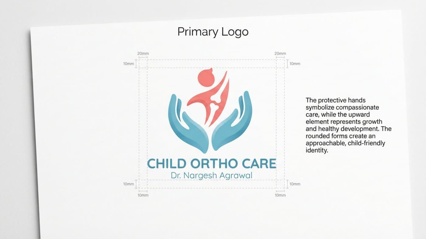
Primary logo — protective hands cradling a child
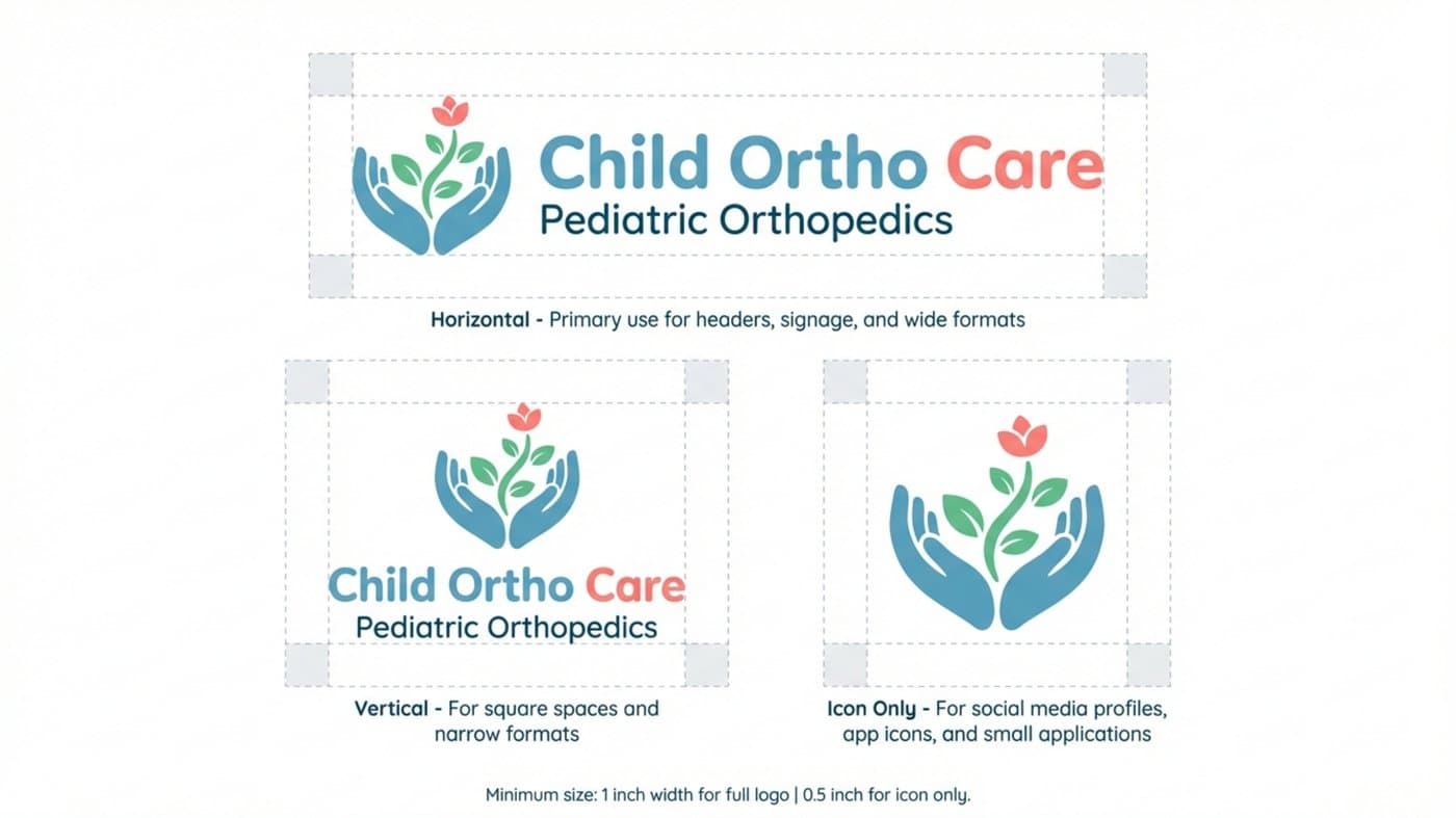
Logo system — horizontal, vertical, and icon variations
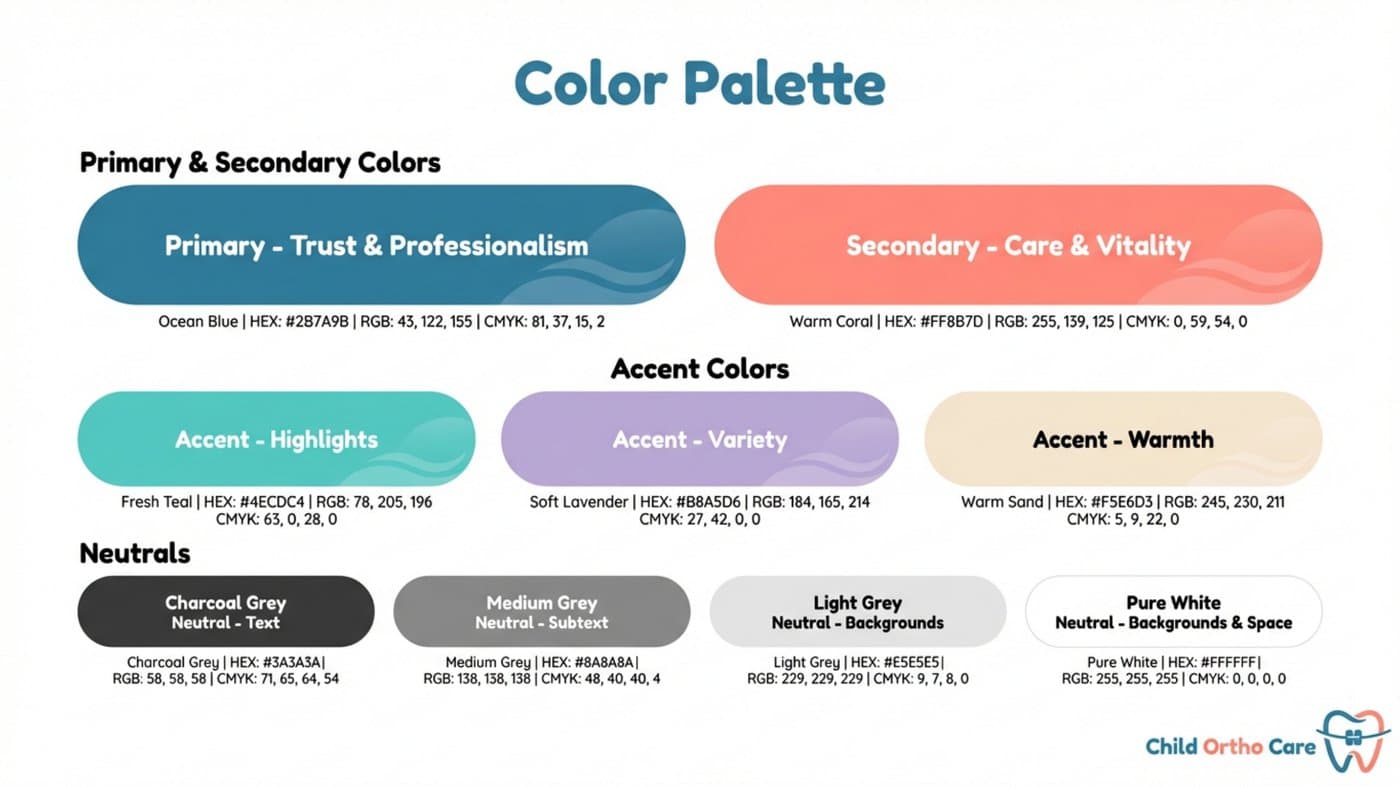
Color system — Ocean Blue, Warm Coral, and accent shades
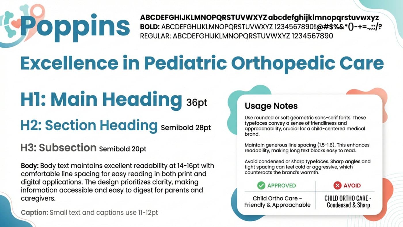
Typography — Poppins family with heading hierarchy

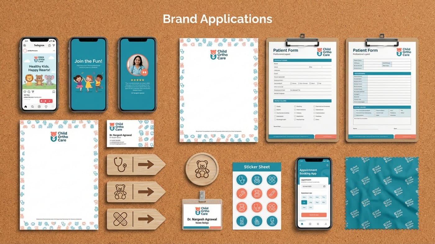
Full brand applications — stationery, social, forms, signage, ID badges
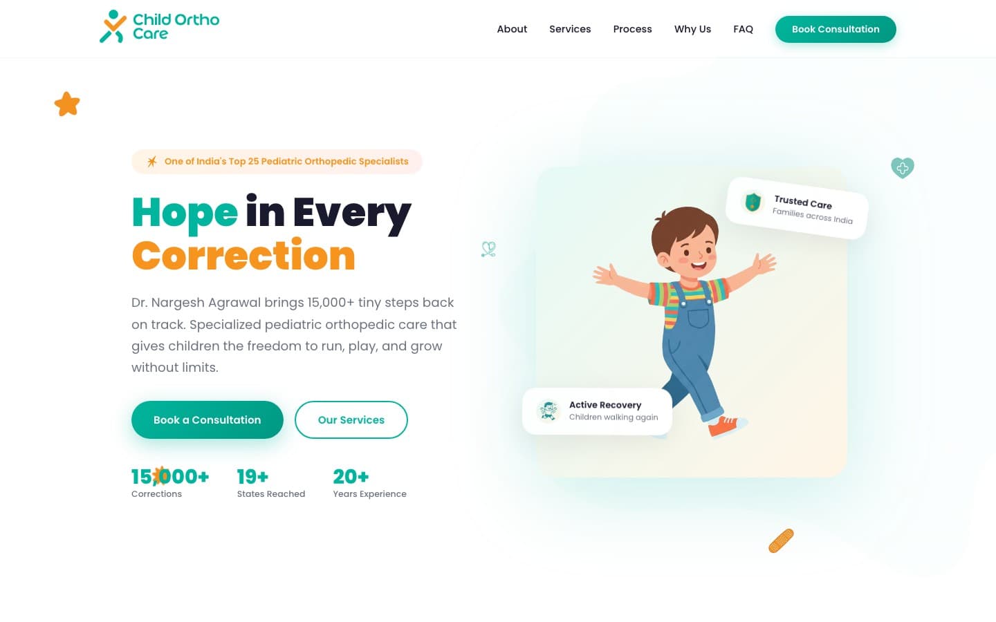
Live website — child-friendly pediatric orthopedic practice site
Want results like this?
Book a free discovery call and let's build a brand identity that sets your practice apart.