Loading...
Full IdentityIndiaDelivered in 5 days
Anton Global Pharmaceuticals
Pharmaceutical
Complete brand ecosystem for a pharmaceutical conglomerate — master logo, 5 sub-brand identities, custom iconography, stationery suite, and a cutting-edge 3D animated website.
Timeline
5 days
Deliverables
10 items
Industry
Pharmaceutical
Package
Full Identity
About the Project
Anton Global Pharmaceuticals (established 2010, Mumbai) bridges the gap between India's pharma manufacturing prowess and global pharmaceutical needs, specializing in APIs and pharmaceutical intermediates. They needed more than a logo — they needed a brand architecture that could flex across five distinct business verticals: Anton Pharmaceuticals, Anton Life Sciences, Anton Global, Anton Global Digital, and Anton Gradient. We designed a logo mark fusing a medical cross with DNA helical structure, then extended it into a complete sub-brand system using ITC Avant Garde and Product Sans typography. The stationery suite includes three visiting card variants, letterheads, envelopes, and invoices — all print-ready in CMYK. But the crown jewel was the website: built on Astro with Three.js, featuring a 3D DNA helix animation in the hero, horizontal-scroll 'Why Us' sections, a searchable product catalog of 116+ APIs grouped A-Z, magnetic interactive elements, and a dark tech-forward aesthetic that positions Anton as a modern pharmaceutical powerhouse — not a traditional pharma company.
BrandingSub-brandsGuidelinesStationeryWebsiteIconography
What We Delivered
- Master logo mark (Medical cross + DNA fusion)
- 5 sub-brand logo systems (Pharmaceuticals, Life Sciences, Global, Global Digital, Gradient)
- 20-page brand guidelines PDF
- Custom pharmaceutical icon set (8 icons)
- 3 business card design variants (CMYK print-ready)
- Letterhead, envelope, and invoice design
- Full website with Three.js 3D DNA animation
- Searchable product catalog (116+ APIs, A-Z grouping)
- Horizontal-scroll interactive sections
- Dark tech-forward visual design
The Work
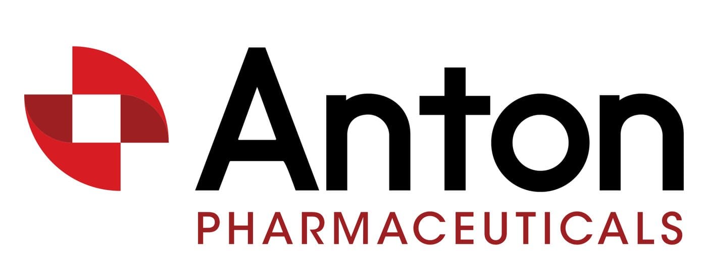
Primary logo — Anton Pharmaceuticals wordmark with DNA-cross symbol
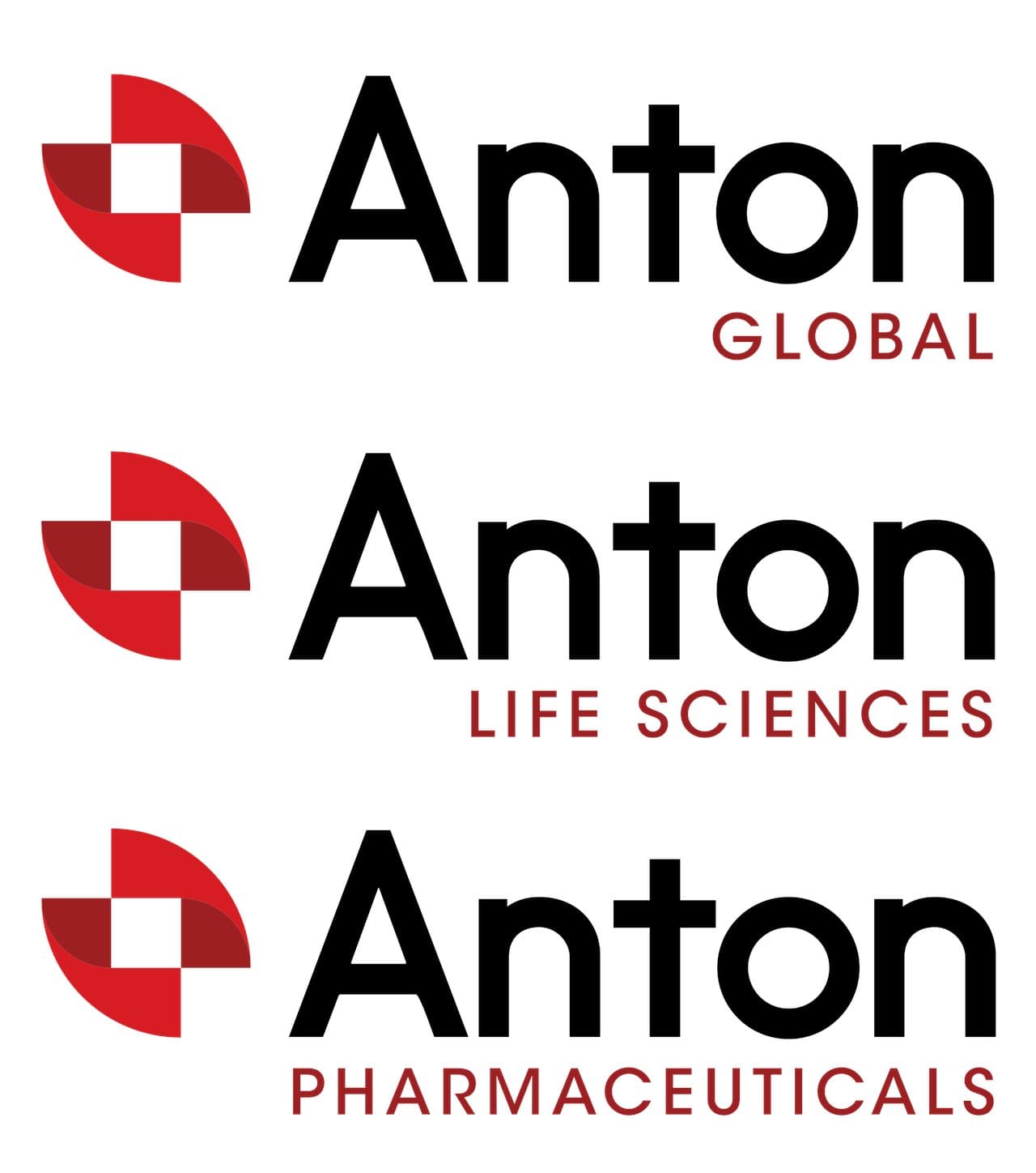
Sub-brand system — Anton Global, Life Sciences, and Pharmaceuticals
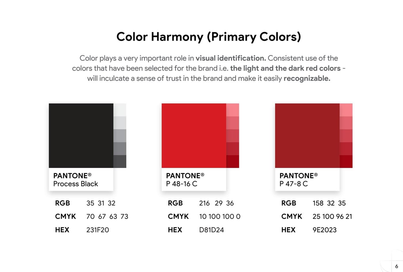
Color system with Pantone, RGB, CMYK, and HEX specifications
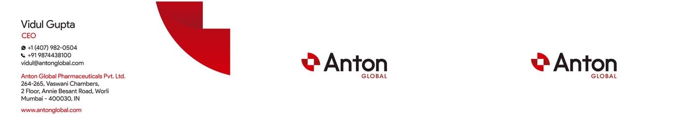
Three business card designs across the brand family
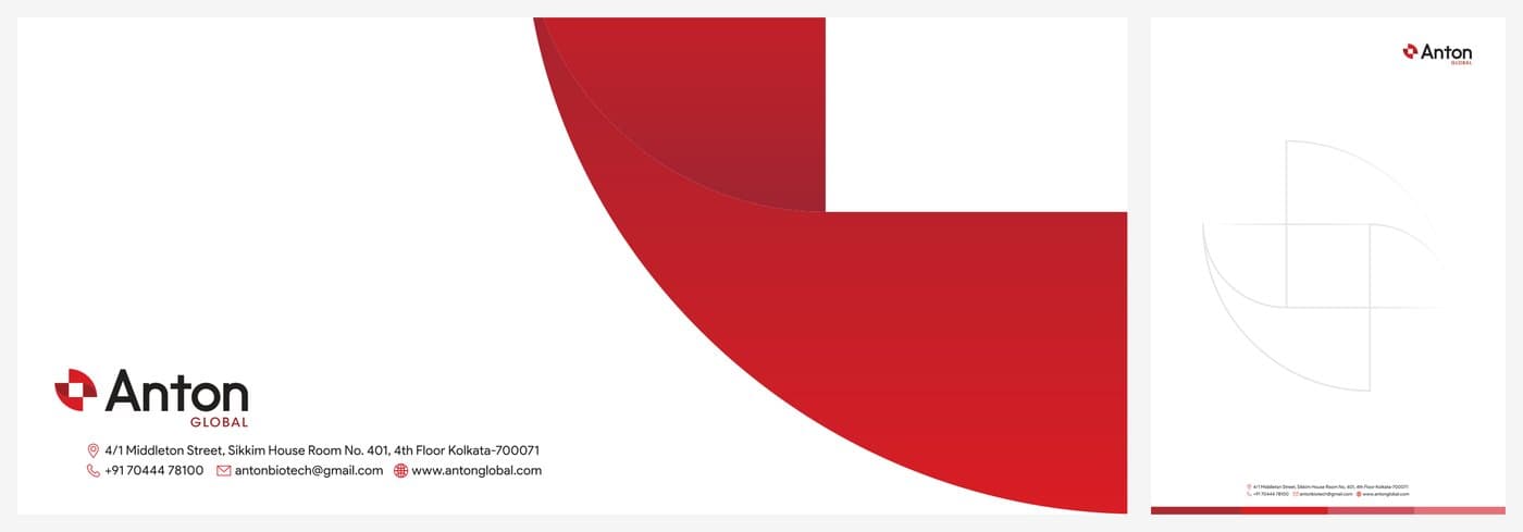
Stationery suite — branded envelope and letterhead

Custom pharmaceutical icon set — DNA, molecules, lab instruments
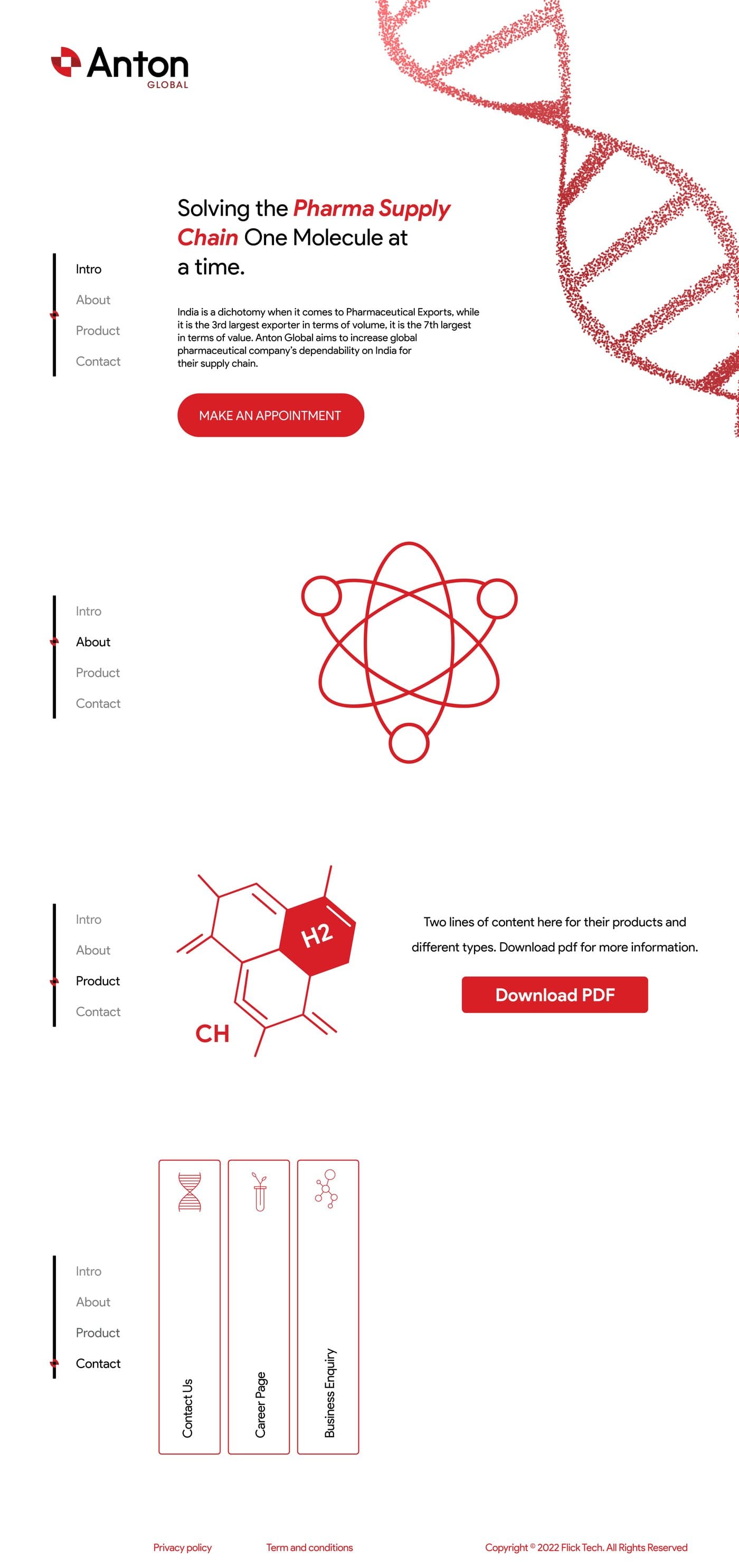
Website homepage design — corporate, investor-ready
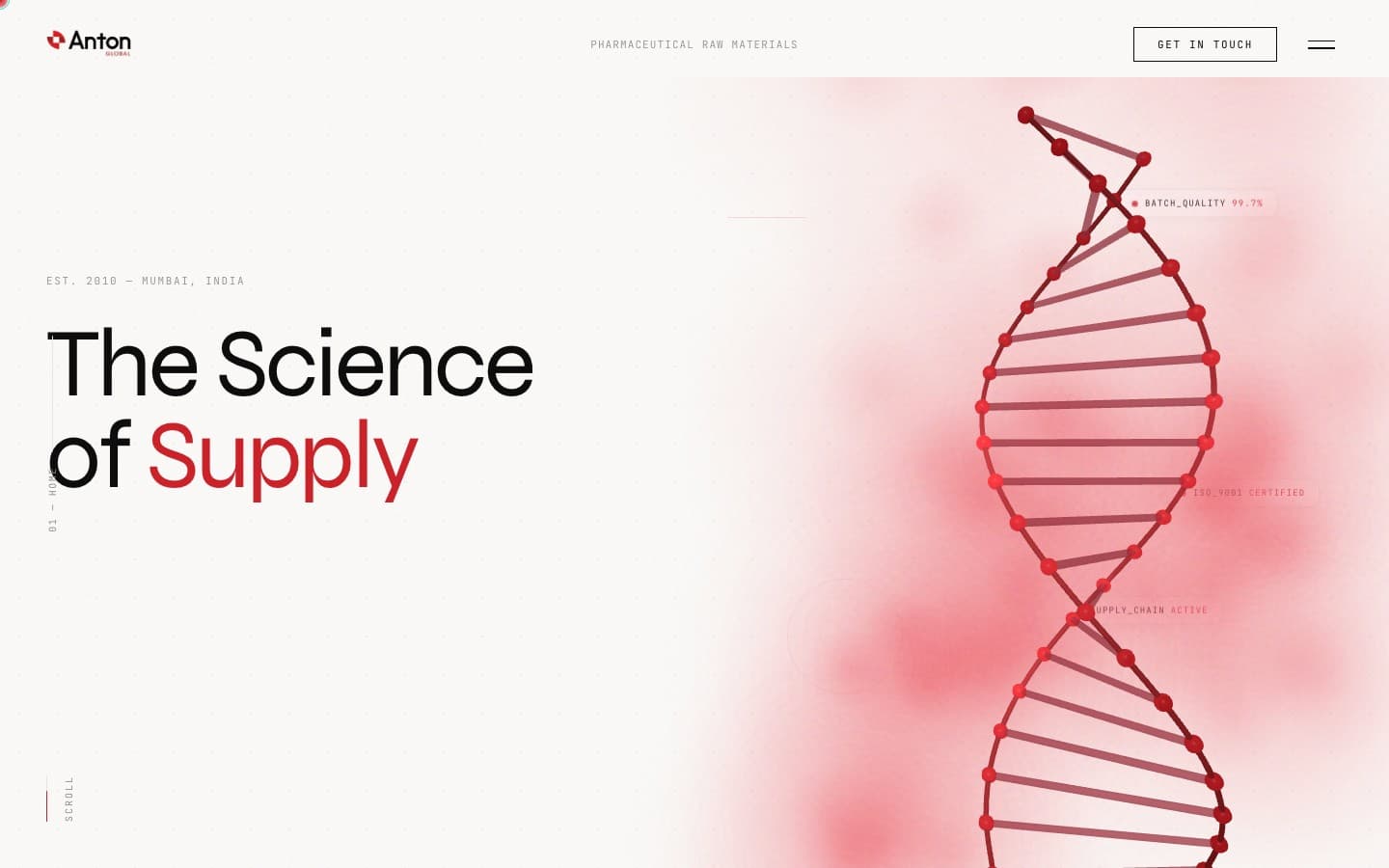
Live website — 3D DNA animation hero with horizontal scroll
Want results like this?
Book a free discovery call and let's build a brand identity that sets your practice apart.